

That is not minimalism. That is poverty of thought.
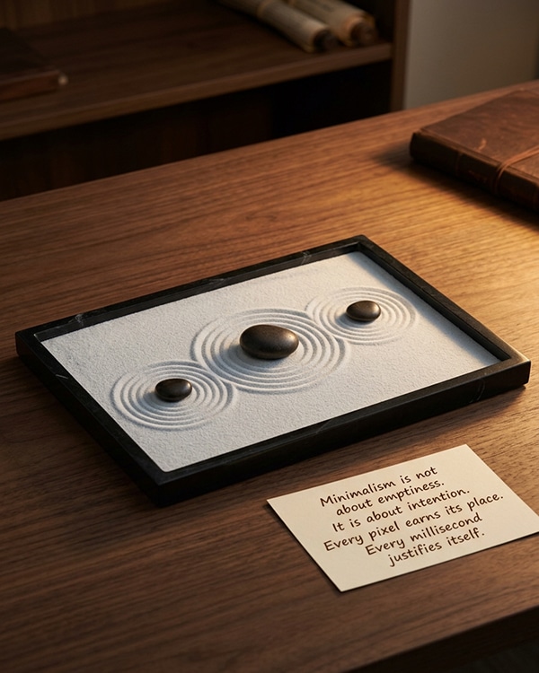
True minimalism is not about making less. It is about making every single element matter. It is about precision. A Japanese rock garden has very few elements, but each rock is placed after hours of meditation. A haiku has only seventeen syllables, but each word carries the weight of a season.
The same applies to your website. It is not about “less is more.” It is about “everything that remains is there for a reason.”
🕯️ Magic Note
The word “minimalism” in design comes from the Bauhaus movement and the principle “Less is more” coined by architect Ludwig Mies van der Rohe. But he did not mean empty. He meant essential. The difference is everything.
Simple removes the chat widget because it looks cluttered. Precise removes the chat widget because it studied user behavior and discovered that no one used it between 2 AM and 6 AM.
Simple uses a sans-serif font because it is clean. Precise uses a specific sans-serif font because its x-height and letter spacing make the text readable on mobile devices in sunlight.
Simple removes the sidebar. Precise removes the sidebar, but adds a single, perfectly timed micro-interaction that guides the eye to the most important content.
Precision is not minimalism. It is minimalism with data, empathy, and intention.
The space between two paragraphs is not empty. It is a breath. It tells the reader, “Pause here. Absorb this before moving on.”
The dark background is not a trend. It is a velvet cloth that holds the content like a jeweler displays a ring. It removes distractions so the message can shine.
The animation is not a gimmick. It is a guide. It draws the eye from the headline to the button, silently, without force, like a hand in the dark.
When you treat every pixel as an employee with a job description, you stop adding things because they “look nice.” You add things because they serve a purpose. And if something does not serve, it leaves. No hard feelings. Just precision.
- Can I read this comfortably without squinting?
- Does the line length feel natural, or does my eye get lost?
- Is there enough contrast between the text and the background?
Typography is not decoration. It is the voice of your brand. If your voice is too small, no one hears you. If your voice is too loud, no one trusts you. The precise voice is comfortable. It does not demand attention. It earns it.
A precise font size is not 12px because “that is standard.” It is 18px because your average reader is forty-five years old and browsing on a phone after a long day of work. That is empathy. That is precision.
🕯️ Magic Note
Studies show that increasing font size from 12px to 16px can increase reading speed by 20% and comprehension by 15%. Typography is not about beauty. It is about respect.
Space is not wasted. Space is where trust grows.
When you add generous padding around a button, you are not just making it look modern. You are telling the user, “Take your time. There is no rush. Click when you are ready.”
When you increase the line height of your paragraphs, you are not just following a design trend. You are inviting the reader to stay, to breathe, to actually finish the sentence.
In the physical world, we pay more for space. A bigger hotel room. A wider airplane seat. A restaurant with tables not too close together. Online, we forget. But the psychology is the same. Space communicates value. Precision communicates care.
⚡ Whisper
If I remove this, would anyone notice? Would anyone care?
The logo that takes half the screen? Remove it. The third testimonial that says the same thing as the first two? Remove it. The decorative line that adds nothing but visual clutter? Remove it.
What remains is not empty. It is essential. It is the version of your brand that has been refined, not reduced. It is minimalist, yes. But more importantly, it is precise.
A precise load time is not “fast enough.” It is as fast as physics allows. Because every millisecond you save is a millisecond of respect you give to your visitor.
A precise animation does not bounce, slide, and fade all at once. It moves once, deliberately, and then stops. Because motion should guide, not entertain.
A precise hover effect does not turn a button neon green. It darkens it slightly, enough to say, “I see your cursor. I am ready.” That is conversation. That is respect.
“I thought you were professional,” they think. “But your website feels careless.”
You might not have noticed. But they did. Their finger hovered over the back button. Maybe they stayed. Maybe they did not. Either way, the trust was smaller than before.
Precision is not expensive to implement. It is expensive to ignore.
⚡ Whisper
Minimalism is not about having less. It is about leaving only what matters. Every pixel that remains has earned its place. Every delay has been justified. Every space has a purpose. This is not simple. It is hard. It takes discipline to remove what you love but does not serve. It takes courage to trust that less, done precisely, is more than more, done carelessly. Build not for the eye that skims. Build for the mind that stays. That is precision. That is care. That is the quiet art of being found.


